
Creating brand guidelines is all about setting the ground rules for your brand's personality. It covers everything from how your logo is used and which colors are yours, to the specific voice and tone you use in your writing. The whole point is to make sure every single interaction a customer has with your brand feels cohesive and genuine, which is how you build trust and recognition over the long haul.
Why Your Brand Guidelines Are Failing You
Let's be real for a moment. Most brand guidelines are destined to become forgotten PDFs, gathering digital dust in a shared drive somewhere. Everyone nods along when you talk about consistency, but the typical rulebook often feels more like a creative straightjacket than an empowering tool. It becomes a document designers resent and marketers quietly ignore.

When this happens, it’s not just a minor annoyance; it has real costs. Weak, unclear, or inaccessible guidelines cause problems that ripple through the entire business. You end up with disjointed marketing campaigns where social media posts feel like they’re from a completely different company than the website. Sales teams start creating their own off-brand presentations, and customer support might use a tone that completely clashes with your brand's personality.
The True Cost of Inconsistency
Inconsistent branding creates a jarring and fragmented experience for your customers. Every touchpoint feels like it’s coming from a different company, which slowly chips away at their trust. In fact, one study showed that brands presented consistently are 3 to 4 times more likely to achieve strong brand visibility. When your message is clear and unified everywhere, people know what to expect and feel much more confident engaging with you.
This problem bleeds into your internal operations, too. Without that central source of truth, teams waste an incredible amount of time:
- Designers get stuck answering the same questions over and over about which logo file or HEX code to use.
- Writers agonize over capturing the right voice, which leads to endless and frustrating revision cycles.
- New hires have a much harder time getting up to speed, forced to piece together the brand's identity from random examples they find.
A great set of brand guidelines isn’t a restrictive rulebook. It’s a strategic asset that builds trust, speeds up work, and empowers your team to make confident, on-brand decisions every single day.
From Static Rules to a Strategic Asset
The key is to shift your mindset. Stop seeing your brand guidelines as a static document and start treating them as a living, breathing tool that drives growth. When you get them right, they become the foundation for every piece of content, every campaign, and every customer interaction.
This framework is what allows you to scale your marketing efforts without chaos. Think about it: when you launch a big campaign, you need a unified message hitting across all channels. That same consistency is absolutely vital when you bring in outside partners. A perfect example is influencer marketing—you can learn more about what is influencer marketing and see how solid guidelines ensure every creator's post aligns perfectly with your core identity.
So, before we jump into the "how-to," remember that you're not just creating a style guide. You're building an operational tool that will save time, cut down on friction, and ultimately amplify your brand's impact.
Unearthing Your Brand's Authentic Core
Before you even think about fonts or color palettes, we need to do some real work. The most powerful brand guidelines aren't just about pretty aesthetics; they're built on a rock-solid strategic foundation. This initial discovery phase is all about defining the "why" behind your brand—crafting a 'brand heart' that will inform every single decision you make from here on out.
This is the deep work that makes a brand feel authentic and purposeful. It’s what separates a brand that just exists from one that genuinely connects with people. Let’s get started by figuring out what you’re all about.
Nailing Down Your Mission, Vision, and Values
Your mission, vision, and values are not just corporate buzzwords to stick on a plaque in the lobby. They are the strategic pillars that give your brand direction and meaning. Think of them as your brand’s true north.
To get this right, you need to get your key stakeholders in a room and start asking the tough questions. Don't settle for generic answers; push for real, gut-level insights.
- Mission Statement: What do you actually do, who do you serve, and why should anyone care? This is your purpose, stripped down to its essence. A mission isn't "to sell software"; it’s "to empower small businesses to compete with giants through accessible technology." See the difference?
- Vision Statement: What future are you working to create? This is your big, audacious goal. It’s the world you want to exist because of the work you do. It should feel inspiring and maybe even a little bit intimidating.
- Core Values: What principles actually guide how you operate? These are the non-negotiables that shape your culture and every decision, from hiring to product development. Try to land on 3-5 values that are specific and actionable, like "Simplicity in Everything" or "Always Be Learning."
This strategic core is what keeps everyone aligned. It ensures the marketing team, product developers, and sales reps are all rowing in the same direction, guided by a shared understanding of what truly matters.
Pinpointing Your Target Audience
You can't build a compelling brand if you have no idea who you're talking to. And no, vague descriptions like "millennials" or "small businesses" won't cut it. You need to develop detailed audience personas that feel like real, living people.
Go way beyond basic demographics. You need to dig into their psychographics. What are their goals and biggest headaches? What motivates them? What other brands do they absolutely love, and why? The more detailed you get here, the easier it will be to create messaging and visuals that actually resonate.
For example, instead of targeting "fitness enthusiasts," you might hone in on "busy urban professionals aged 25-35 who value high-intensity, time-efficient workouts and are motivated by seeing data-driven progress." Now that is a person you can design for. This level of clarity directly informs your brand’s tone, imagery, and even the features you build.
Crafting Your Core Messaging and Positioning
Once your purpose is clear and you know your audience inside and out, you can finally figure out what you want to say. This means developing a sharp positioning statement and the core messages that bring it to life.
Your brand positioning statement is a short, internal declaration of your unique place in the market. It’s your stake in the ground. A common formula looks like this: For [target audience], [your brand] is the [category] that provides [unique benefit/differentiator]. To really get a feel for this, studying some inspiring brand positioning examples can help clarify your own market stance.
From that powerful statement, you can build out your key messaging pillars. These are the main themes you want to hit again and again, across every channel. For a project management tool, these pillars might be:
- Effortless Collaboration
- Clear Project Visibility
- Measurable Productivity Gains
This structured approach is what drives real business results. In fact, companies that maintain consistent branding can see a revenue increase of 10% to 20%. The crazy part? While about 95% of companies have brand guidelines, only around 25% actually enforce them, leaving a huge amount of growth on the table.
Defining your brand's core is easily the most critical part of this whole process. This strategic foundation is what transforms a simple style guide into a powerful tool for building a brand that lasts.
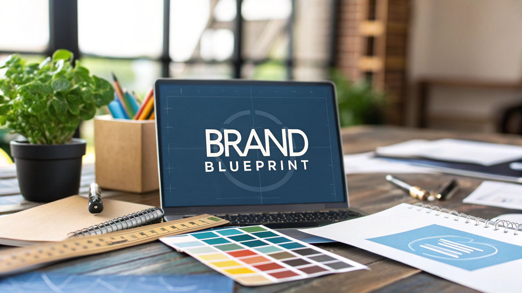
Building Your Visual Identity System
Once you’ve nailed down your brand strategy, it’s time for the fun part: translating all that soul-searching into a tangible visual language. This is where your mission, values, and personality get a face—in the form of logos, colors, and fonts. A well-built visual identity system doesn't just make you look polished; it makes you instantly recognizable and builds a deep sense of trust through consistency.
Think of this process as creating a toolkit. The goal is to build a set of assets and rules so clear that anyone—from your lead designer to a freelance social media manager—can create work that feels undeniably you. It’s about codifying your brand’s look and feel so it’s applied correctly, every single time, on every single platform.
The infographic below offers a great starting point for this creative process, showing how fundamental pieces like color and typography work together.
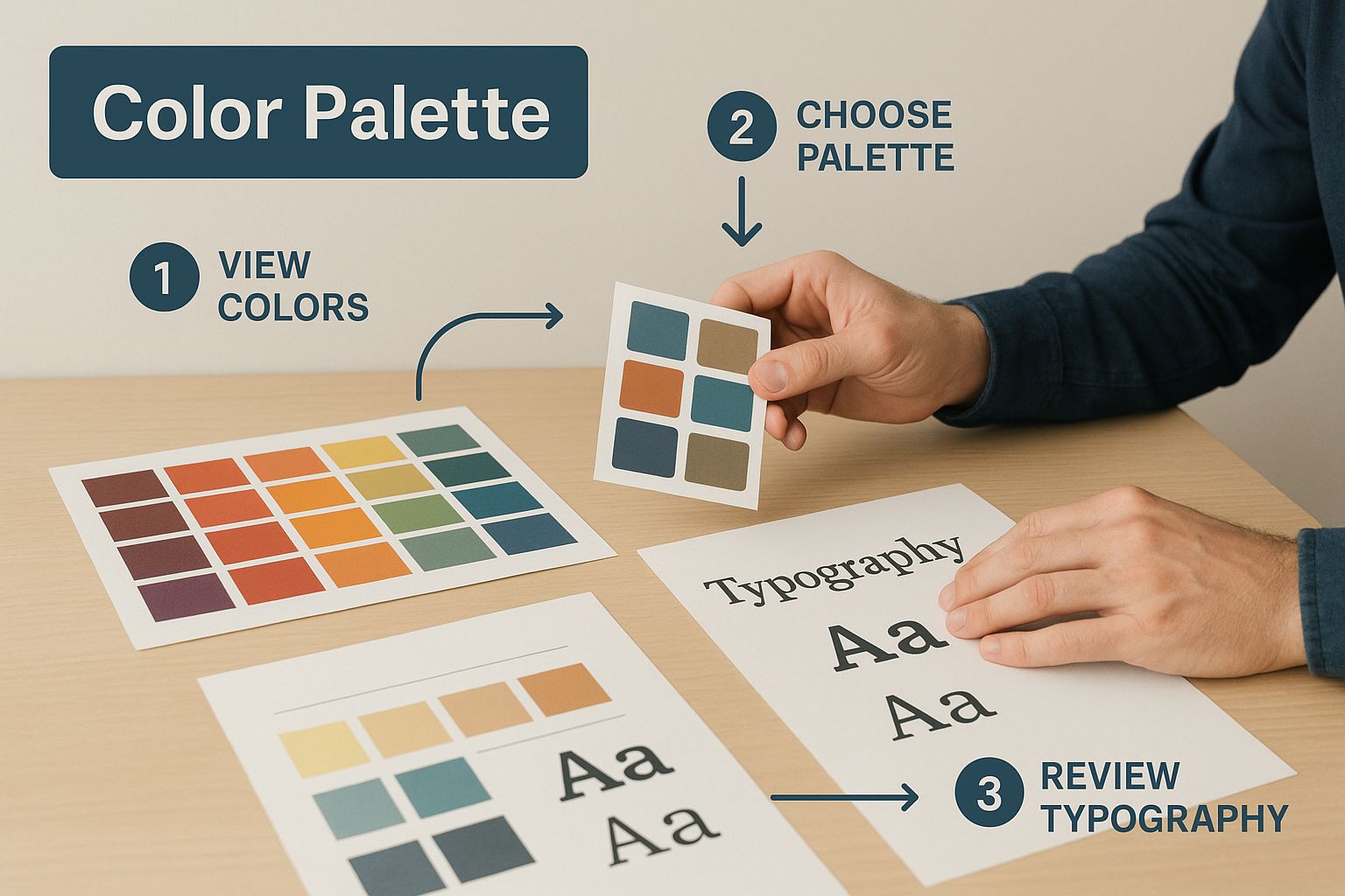
As you can see, these aren't just aesthetic choices. They are strategic decisions that become the bedrock of your entire visual identity.
Your Logo and Its Rules of Engagement
Your logo is the most concentrated version of your brand, so its guidelines need to be airtight. It's not enough to just drop the final JPGs in a shared folder. You have to provide explicit rules for how to use it—and how not to use it—to prevent the kind of misuse that slowly chips away at your brand’s integrity.
First, define the primary logo and all its acceptable variations. This usually includes a stacked version for square spaces (like a social profile), a horizontal lockup for website headers, and a simplified icon or mark for favicons.
From there, you need to establish some non-negotiable ground rules:
- Clear Space: This is the invisible boundary you mandate around the logo. It prevents other elements from crowding it and diminishing its impact. A pro tip is to use a key element from the logo itself—like the height of a letter or the width of an icon—as the unit of measurement for this exclusion zone.
- Minimum Size: You have to specify the absolute smallest the logo can be shown in both digital (pixels) and print (inches or millimeters) formats. This is crucial for legibility, ensuring it doesn't become a blurry smudge on something small like a business card or a mobile banner.
- Improper Usage: Honestly, this might be the most helpful section for non-designers. Show, don't just tell. Create a "what not to do" grid with visual examples of stretching the logo, changing its colors, adding a drop shadow, or placing it on a low-contrast background.
Crafting a Strategic Color Palette
Color is pure psychology in branding. It’s an emotional shortcut. In fact, a signature color can boost brand recognition by up to 80%, and research shows that around 90% of snap judgments made about products are based on color alone. With that much on the line, you have to define your palette with absolute precision. You can discover more insights about the power of color in branding to see what it can mean for your business.
Your color guidelines should clearly define:
- Primary Colors: These are the 1-3 workhorses of your brand. They should be directly inspired by your brand's personality—a vibrant coral might scream creativity, while a deep forest green conveys stability and growth.
- Secondary Colors: Think of this as a supporting palette of 2-4 colors. They’re perfect for accents, highlights, calls-to-action, or distinguishing different product lines. They need to complement your primary colors, not fight them for attention.
- Neutral Colors: Don't forget the basics. Define your go-to shades of gray, black, or off-white. These are essential for things like body text and backgrounds, and they do the heavy lifting of creating a clean visual hierarchy.
For every single color, you must provide the exact color codes. This is non-negotiable. Include the HEX code for web, RGB for digital screens, and CMYK for printed materials to ensure perfect color matching across all media.
Establishing a Typographic Hierarchy
If your brand had a voice, typography would be it. The fonts you choose have their own distinct personality—modern and minimal, classic and elegant, or friendly and approachable. Your guidelines need to create a simple system that anyone can follow.
Start by selecting a primary and (maybe) a secondary typeface. A classic approach is to pair a distinct font for headings (like a bold serif) with a super-legible font for body text (like a clean sans-serif). Whatever you choose, limit your brand to two or three font families at most. Any more than that, and things start to look cluttered and unprofessional.
Next, build a clear typographic hierarchy. This means defining the specific font, size, weight (e.g., Bold, Regular, Light), and color for each level of text. For instance:
- Heading 1 (H1): For main page titles.
- Heading 2 (H2): For major section titles.
- Body Text: For all your standard paragraphs.
- Captions/Labels: For smaller, descriptive text.
A well-defined hierarchy isn't just about looks; it dramatically improves readability and guides the user’s eye exactly where you want it to go.
This table summarizes the core visual elements we've just covered, offering a quick-glance guide to what you need to define.
Core Components of a Visual Identity Kit
| Visual Element | Key Considerations | Example Rule |
|---|---|---|
| Logo | Primary, variations, clear space, minimum size, misuse. | "The logo must always be surrounded by a clear space equal to the height of the 'N' in the wordmark." |
| Color Palette | Primary, secondary, and neutral colors. | "Our primary blue is HEX #0A2351. Use for headlines and primary CTAs. Do not use for body text." |
| Typography | Font families, sizes, weights, and hierarchy (H1, H2, body). | "All H2 headings must be Poppins Bold, 32px. All body text must be Lato Regular, 16px." |
| Imagery Style | Photography mood, subject matter, composition, and color grading. | "Photography should feature authentic, candid moments with warm, natural lighting. Avoid stock photos." |
| Iconography | Style (line art, filled, etc.), line weight, and color usage. | "Icons should be simple, single-color line art with a 2px stroke weight." |
Putting these rules in place ensures every visual element works together to tell the same cohesive story.
Defining Your Imagery and Graphic Style
Finally, your brand guidelines need to set the tone for all supporting visuals—photography, illustrations, and icons. Without this direction, your visual assets can quickly become a messy, inconsistent collage that feels completely disconnected.
Ask yourself what kind of imagery really fits your brand's personality. Is it bright, airy, and full of natural light? Or is it more dramatic and high-contrast? Should your photos feature real customers, or are staged, conceptual shots a better fit? The best way to do this is to provide a "mood board" of example images that perfectly capture the desired feeling, composition, and subject matter.
The same goes for illustrations or icons. Define their style clearly. Are they hand-drawn and whimsical, or are they geometric and minimalist? Specify things like line weights, color application rules, and overall complexity. This ensures every single graphic element, from a major website illustration down to a tiny social media icon, is clearly contributing to a single, unified visual story.
Defining Your Brand's Voice and Tone
How your brand looks is only half the battle. A brilliant visual identity can fall completely flat if the messaging feels disconnected or just… off. This is where we nail down your brand's verbal identity, making sure you sound like the same company everywhere—from a quick tweet to a formal press release.

Here's the easiest way I've found to think about it: your brand voice is your unchanging personality. Your tone, on the other hand, is the emotional inflection you use in different situations. Your voice is consistent, but your tone has to be flexible. You wouldn't use a hyped-up, playful tone to address a customer's serious technical glitch, right?
Choosing Your Core Voice Characteristics
First things first, you need to pinpoint your brand's core personality traits. A fantastic starting point is to choose 3-5 descriptive adjectives that really capture the communication style you're aiming for. Try to push past generic words like "professional." They don't give a writer much to work with. Go for words with more flavor.
To get the wheels turning, think about where your brand sits on these kinds of spectrums:
- Funny vs. Serious: Do you crack jokes and use humor, or is your subject matter more straight-laced?
- Formal vs. Casual: Is your language buttoned-up and corporate, or is it more like talking to a friend?
- Respectful vs. Irreverent: Do you play by the industry's rules, or are you here to shake things up?
- Enthusiastic vs. Matter-of-fact: Are you your customer's biggest cheerleader, or a calm, straightforward expert?
For example, a fintech company might zero in on voice characteristics like Authoritative, Clear, and Supportive. A direct-to-consumer lifestyle brand could go a completely different route, landing on Witty, Passionate, and Bold. These words become the North Star for anyone writing on behalf of your brand.
Adapting Your Tone for Different Channels
Once you’ve locked in your core voice, it's time to show how it flexes in the real world. This is where you get practical and provide concrete examples of your tone in action. Your brand guidelines need to demonstrate how the tone shifts for different channels and scenarios while the underlying voice stays put.
Your brand voice is the foundation of who you are. Your tone is how you express that voice in different rooms. It’s about being authentic to your personality while also being appropriate for the context of the conversation.
Let's imagine a brand whose voice is "Empowering and Playful." Here’s a look at how their tone might adapt:
- Social Media Post (Instagram): The tone here is super energetic and engaging. "You crushed that workout! 💪 Time to refuel. What’s your go-to post-gym snack? Drop it in the comments! 👇"
- Customer Support Email (Serious Issue): The playfulness takes a backseat. The empowering, supportive side of the voice shines through. "We understand how frustrating this is, and we’re here to help you get this sorted out quickly. Let’s walk through the solution together."
- Website UX Copy (Error Message): The tone is helpful and reassuring, never alarming. "Oops! Looks like that page took a wrong turn. Let’s get you back on track."
Giving people these tangible examples is the key. It removes all the guesswork and empowers your team to write with confidence, no matter the situation.
Documenting the Nitty-Gritty Details
Okay, now it's time to get into the weeds. This is where you lay down the specific rules of your verbal style. Nailing these details is what creates that polished, consistent feel across everything you write. I always recommend including a simple "Do's and Don'ts" table in the guidelines.
Getting this right often means you need to understand the differences between copywriting and content writing, since each serves a different strategic purpose and might require a slightly different tonal application.
Be sure to cover these key areas in your guidelines:
- Grammar and Punctuation: Do you use the Oxford comma? (A classic debate!) Do you prefer title case or sentence case for your blog post headlines? Be explicit.
- Vocabulary: Are there specific words you love and others you want to banish? For example, maybe you always say "team members" instead of "employees," or "partners" instead of "clients."
- Industry Jargon: Define how you talk about key concepts in your field. Clarify any acronyms and make a call on whether you'll simplify complex terms for a wider audience.
- Formatting: Lay out the ground rules for using bolding, italics, bullet points, and even emojis. This keeps your written content looking as consistent as it sounds.
By defining both the big-picture personality and the small-but-mighty mechanics of your language, you create a complete verbal identity system that anyone—from a new hire to a freelance writer—can pick up and use effectively.
Creating a Guideline Document People Actually Use
https://www.youtube.com/embed/i3h3Km5f0BU
You've done all the hard work—the strategic thinking, the creative exploration, the difficult decisions. But all of that effort is wasted if the final result is a clunky, 100-page PDF that gathers digital dust in a forgotten folder.
The last, and maybe most important, piece of the puzzle is execution. This is where we turn all those ideas into a living resource that people not only can use, but want to use.
This is where so many brands stumble. They build a perfect rulebook but forget to build the roads that lead to it. To avoid that fate, you have to start thinking like a user experience designer. The goal? Make it easier to stay on-brand than to go off-brand.
Choosing the Right Format for Your Team
The classic PDF brand book isn't dead, but it's often not the best tool for the job. It's great for sending to outside partners, but for your internal team, a dynamic format will almost always get more traction.
Think about how your team actually works and weigh the options:
- The Classic PDF: It’s simple, portable, and anyone can open it. The big downside? It's a snapshot in time. The second you export it, it's already on its way to being outdated. It also makes finding one specific hex code feel like a scavenger hunt.
- An Internal Wiki (like Notion or Confluence): This is a fantastic, low-cost starting point. Wikis are a breeze to update, they're searchable, and you can link directly to specific sections. This is a huge time-saver when a designer just needs the right logo version and wants to get on with their day.
- A Web-Based Brand Hub: For bigger organizations, this is the gold standard. A dedicated microsite can be beautifully designed, interactive, and acts as the central source of truth for everything from brand strategy to downloadable logo files. Check out how companies like Dropbox Design or Spotify do it for some top-tier inspiration.
The best format is the one that fits into your team's existing workflow. If your entire company lives in Notion, build your guidelines there. Don't make them learn a new tool they'll never open.
A good rule of thumb is to start simple. A well-organized wiki that people actually use is far better than an ambitious web hub that takes six months to build and launch. You can always level up your format as the brand and team grow.
Structuring Your Document for Clarity
No matter the format, organization is everything. When people reach for the brand guidelines, they're usually in a hurry. They need an answer, and they need it now. A logical, predictable structure is your best friend.
Break your document into clear, top-level sections that tell a story:
- Our Brand Foundation: Start with the why. This is home base for your mission, vision, values, and audience personas. It gives much-needed context to all the rules that follow.
- Visual Identity: This is the nitty-gritty of design. Think logo usage (and misuse!), color palettes, typography, photography styles, and iconography.
- Verbal Identity: Here’s where you’ll define your voice and tone. Add in key messaging pillars, grammar no-nos, and a few real-world examples of "say this, not that."
- Application Examples: Don't just tell people the rules; show them what success looks like. Include mockups of social media posts, presentation slides, or email signatures so they can see all the elements working together.
- Assets & Resources: Make it easy for people to do the right thing! This section should be a one-stop shop for downloads—links to logo files, font files, slide templates, and any other approved assets.
This kind of clear signposting turns a daunting manual into a quick and genuinely helpful reference tool.
Launching and Governing Your New Guidelines
Pressing "publish" is just the beginning. Now you have to get people to use it and set up a system to keep it from going stale. Think of your rollout as an internal marketing campaign.
First, plan a proper launch. Don't just fire off a company-wide email with a link and hope for the best. Hold a quick training session (or record one) to walk everyone through the new resource. Show them what's new, explain the reasoning behind key decisions, and most importantly, show them how to find what they need in 30 seconds or less.
Next, you need a governance plan. Brands evolve, and your guidelines must evolve with them. Appoint a "brand guardian" or a small committee to own the document. They're responsible for reviewing and approving updates, which stops the guide from becoming irrelevant. For instance, as you start collaborating with new creators, ensuring they get the latest guidelines is critical. Our primer on influencer marketing best practices shows just how vital this alignment is to a campaign’s success.
Finally, make the guidelines impossible to ignore. Weave them into your company's daily operations. Link to them in your project management templates. Add them to the onboarding checklist for new hires. Reference them during creative reviews. By making your brand guidelines a living, breathing part of how you work, you guarantee they'll be a tool that empowers your team for years to come.
Common Questions About Brand Guidelines
Even with the best plan in place, a few questions always seem to surface when you're creating and rolling out brand guidelines. I've been there. Let’s tackle some of the most common hurdles I see teams run into. Getting these answers sorted out will make your final document far more practical and effective.
So, how long should a brand guide actually be? People ask this all the time, and honestly, there's no magic number. A new startup might only need a tight, 10-page PDF, while a massive global company could need an entire digital portal.
The goal isn't to hit a specific page count; it's usefulness. Your guide should give a freelance designer or a new marketing hire everything they need—logo usage, color codes, typography, voice—to create on-brand work without having to ask a million questions. Start with the essentials and let it grow with your brand.
Another thing that comes up is how often the guidelines should be updated. The answer is simple: treat your brand guide like a living document. It’s not a dusty rulebook that sits on a shelf.
I always recommend a formal review at least once a year. This is your chance to make sure the guidelines still reflect your business goals and how you're positioned in the market. That said, don't wait for the annual review if something big happens, like a major product launch or a rebrand.
The trick is having a simple, clear process for making and communicating changes so everyone stays in the loop.
Clarifying Key Terms and Roles
You’ll hear people use "brand guide" and "style guide" as if they're the same thing, but there’s a small but important difference.
A brand guide is the whole package. It dives into the "why"—your mission, vision, values, and personality—and connects it to the "how" of your design and messaging rules. A "style guide," on the other hand, often just focuses on the visual or editorial specifics. To really empower your team, you want to build a comprehensive brand guide that ties your strategy directly to your execution.
Finally, who gets a seat at the table when creating this? Brand guidelines should never be a solo project. It has to be a team sport. A brand manager or marketing lead might steer the ship, but you need perspectives from all over the company.
- Leadership: They provide the strategic vision and give the final sign-off.
- Designers: They’re the ones who will define and document the visual identity.
- Writers: They'll be instrumental in shaping the brand’s voice and tone.
- Sales and Product Teams: They know what resonates with customers and can make sure the guidelines work in the real world.
Bringing everyone together creates buy-in from day one and results in a guide that people actually use. This is especially true when you bring in outside partners. For example, understanding the role of influencer marketing in ecommerce makes it obvious why creators need clear, actionable guidelines to represent you well. If you’re looking for a great framework to follow, this easy step-by-step guide on creating brand guidelines is a fantastic resource.
Ready to manage your influencer relationships with perfect brand consistency? REACH provides the tools you need to share guidelines, approve content, and track performance, all in one platform. Discover how REACH can streamline your next campaign.
