
Your team probably has this photo sitting in drafts right now. The product looks good, the lighting seems fine, and the caption took longer than it should have. You post it, wait, and then watch it disappear into the feed with barely any response.
That usually isn't a creativity problem. It's a framing, capture, and publishing problem.
If you want to learn how to take photos on instagram that earn attention, start by treating the image as content design, not decoration. The best-performing photos aren't always the most polished. They're the ones that read clearly on a small screen, fit the format they were made for, and feel believable enough to stop the scroll.
Why Your Instagram Photos Arent Getting Noticed
You post a photo that looked strong in the camera roll. On Instagram, it reads flat, the subject gets lost, and the post disappears before anyone cares enough to stop.
That usually happens because the image was shot to look good in isolation, not to perform on a crowded mobile feed.
Brands often overvalue polish and miss the basics that drive response. People decide fast. If the subject is unclear, the crop feels awkward, or the image looks too produced to feel believable, the post gets skipped even if the product itself is attractive.
The problem gets worse in real-world shooting conditions. Store lighting is mixed. Window light shifts. Skin tones and clothing colors react differently from one setting to the next. A pose or angle that flatters one person can make another look stiff or poorly framed. Generic photo advice rarely helps with that, but Instagram performance depends on handling those details well.
What gets ignored
A few patterns show up repeatedly in underperforming brand posts:
- The subject is not obvious fast enough. If people need to search the frame, they keep scrolling.
- The photo feels over-processed. Heavy editing can make a post look more like a generic ad than something worth engaging with.
- The framing does not match how people view Instagram. Small subjects, awkward crops, and too much empty space weaken even a strong concept.
- The image does not feel real enough for the brand. Audiences respond better when photos feel specific to an actual moment, place, customer, or use case.
Practical rule: If someone cannot tell what matters in the image within one second, fix the shot before you fix the caption.
I see this a lot with new brand managers. They spend time making the image cleaner, brighter, or more polished, but the post still has no focal point and no human signal. A slightly imperfect photo often outperforms a sterile one if it has clear intent, believable context, and a subject that reads immediately on a phone.
That is also why better results usually come from stronger creative decisions, not just posting more often. If your team is diagnosing weak photo performance, this guide on how to increase engagement on Instagram is a useful companion because it connects visual choices to response.
What works instead
Strong Instagram photos do two jobs at once. They are easy to read in a second, and they feel natural enough that people do not dismiss them as disposable brand content.
In practice, that means making trade-offs on purpose. A studio-clean image can work for launches or hero assets. For day-to-day engagement, photos taken in believable environments usually do better when the light is handled well, the crop is deliberate, and the shot respects different body types instead of forcing everyone into the same pose. That is the difference between content that looks styled and content that feels relevant.
Master Your Phone Camera Before You Open Instagram
Instagram's camera is convenient. Your phone's native camera is better.
If you're serious about how to take photos on instagram, do the work before the app ever opens. Native camera tools give you more control over focus, exposure, and framing. Those three decisions do more for quality than any filter ever will.
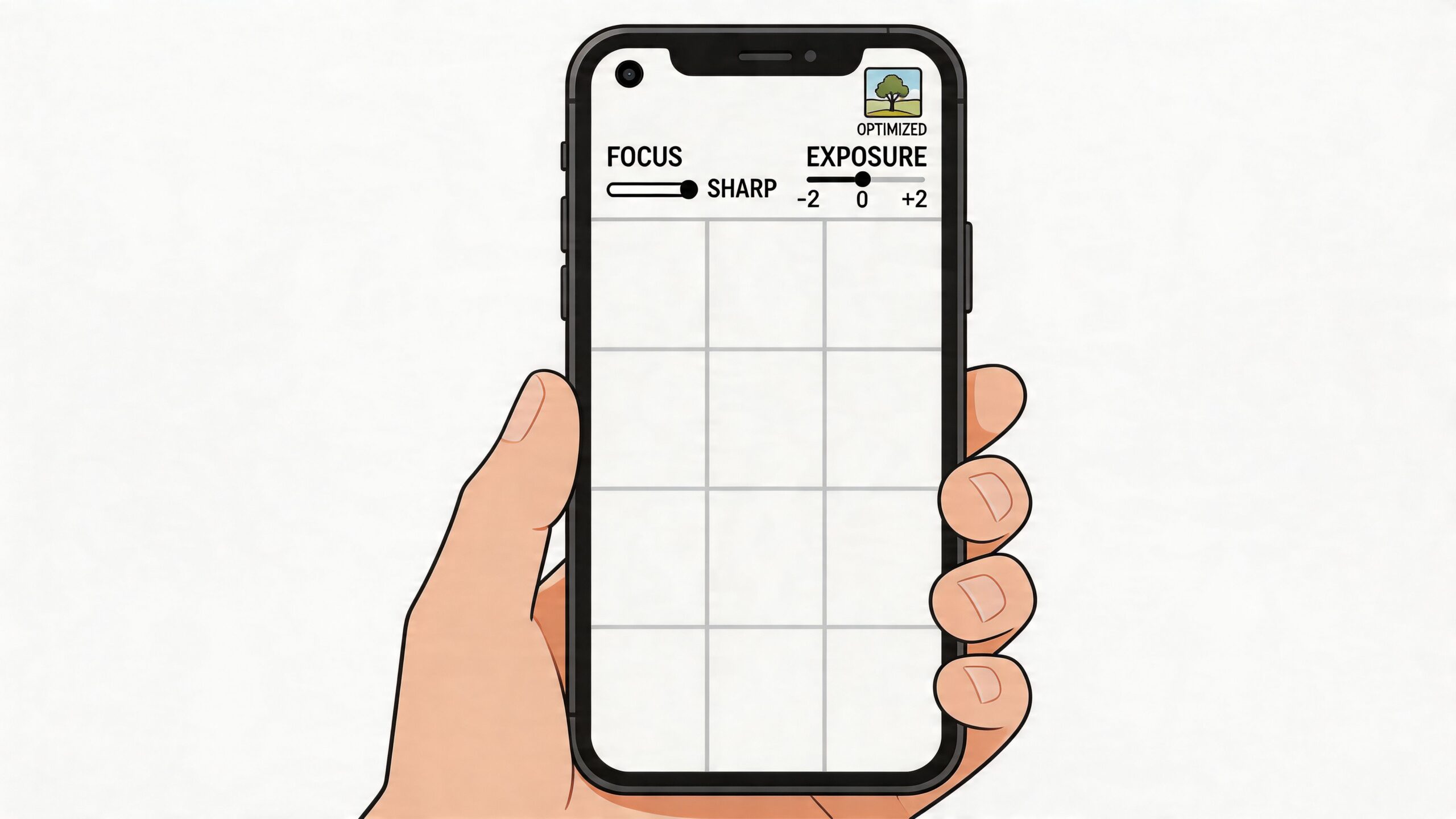
Lock focus and control exposure
The fastest improvement to make is learning how to stop the camera from guessing.
On iPhone, tap your subject to create the yellow AE/AF Lock box, then adjust exposure with the sun icon. According to expert guidance on exposure and composition, exposure between 0 to +0.5 EV can yield 20-30% higher engagement, and using grid-based composition with subjects placed at intersections can garner 30% more likes than centered shots.
That sounds technical, but the workflow is simple:
Tap the subject first
If you're shooting a face, tap the eye area or the part of the product you want tack sharp.Hold for lock when needed
If the light is shifting or the subject is moving slightly, lock focus and exposure so the phone stops recalculating.Adjust brightness manually
Pull exposure down if highlights are blowing out. Push it up slightly if the image is muddy. Don't trust auto every time.
A lot of weak photos aren't blurry because the lens is bad. They're blurry because the camera focused on the wrong part of the frame.
Turn on the grid and stop centering everything
New creators center subjects because it feels safe. Safe compositions often look static.
Turn on your grid in camera settings and start using the intersections. Put a face, product edge, hand, or horizon line where the eye naturally lands. This creates movement inside a still image, which matters more on Instagram than people think.
A few practical composition fixes:
- For portraits place the eyes near the upper third line.
- For products leave breathing room around the item so text overlays don't crush the image later.
- For places or interiors use doorways, shelves, windows, or table edges as natural leading lines.
- For food avoid shooting everything from chest height. Go overhead or get lower and shoot across the table.
Centering a subject isn't wrong. It's just rarely the strongest first choice for feed content.
Use portrait mode carefully
Portrait mode is useful, especially when you need subject separation fast. It can also look fake if the edges break down around hair, glass, hands, or detailed packaging.
Use it when the background is messy and you need to simplify the frame. Skip it when the scene already has natural depth. A normal lens shot in good light often looks more credible than aggressive blur.
Build a short pre-shot checklist
When I'm coaching teams, I tell them to slow down for five seconds before they shoot. That pause saves time later.
Use this checklist:
| Check | What to look for |
|---|---|
| Focus | Is the most important part of the image actually sharp? |
| Exposure | Are bright areas still holding detail? |
| Background | Is anything distracting behind the subject? |
| Edges | Are there cut-off objects pulling attention away? |
| Intent | Is this photo for feed, Story, or carousel cover? |
Choose light that helps instead of fighting it
You don't need expensive lighting to get better photos. You need light that's predictable.
Window light is usually the easiest place to start. Stand the subject near the window, turn them slightly, and avoid harsh overhead room lighting if possible. Outdoors, softer light is easier to work with than hard midday sun because it gives your phone more room to hold detail.
If you're shooting in bright conditions, don't try to rescue a blown-out image later. Get it right in camera. Editing helps refine a photo. It doesn't reliably fix bad capture decisions.
Frame Your Shots for Every Instagram Format
A photo can be well shot and still fail because it wasn't composed for where it will appear.
This is one of the most common mistakes in brand content. Teams shoot one image, then try to force it into feed, Stories, cover art, and ads. That usually leads to cropped heads, cramped products, and text sitting on top of the subject.
Shoot with the final placement in mind
Before you take the shot, decide where it belongs.
A feed image needs a strong visual center and enough breathing room for cropping. A Story needs space for stickers, captions, links, or polls. A Reel cover has to read well as a thumbnail, not just as a full-screen frame.
If you know the destination first, framing gets easier.
Instagram aspect ratios and dimensions for 2026
| Placement | Recommended Aspect Ratio | Optimal Resolution (Pixels) |
|---|---|---|
| Feed square post | 1:1 | 1080 x 1080 |
| Feed vertical post | 4:5 | 1080 x 1350 |
| Feed landscape post | 1.91:1 | 1080 x 566 |
| Stories | 9:16 | 1080 x 1920 |
| Reels cover | 9:16 | 1080 x 1920 |
Practical framing decisions
For feed posts, vertical usually gives you more screen space. That's useful when you want the subject to feel larger and more immediate.
For Stories, leave negative space. If your subject fills the whole frame, you'll have nowhere to put text without covering the important part of the image.
For carousel covers, make the first frame simple. The cover isn't the place for a busy collage effect unless the design is extremely deliberate. One clear focal point works better than several competing ones.
If you think you'll need to crop later, step back slightly when you shoot. A little extra room saves strong photos.
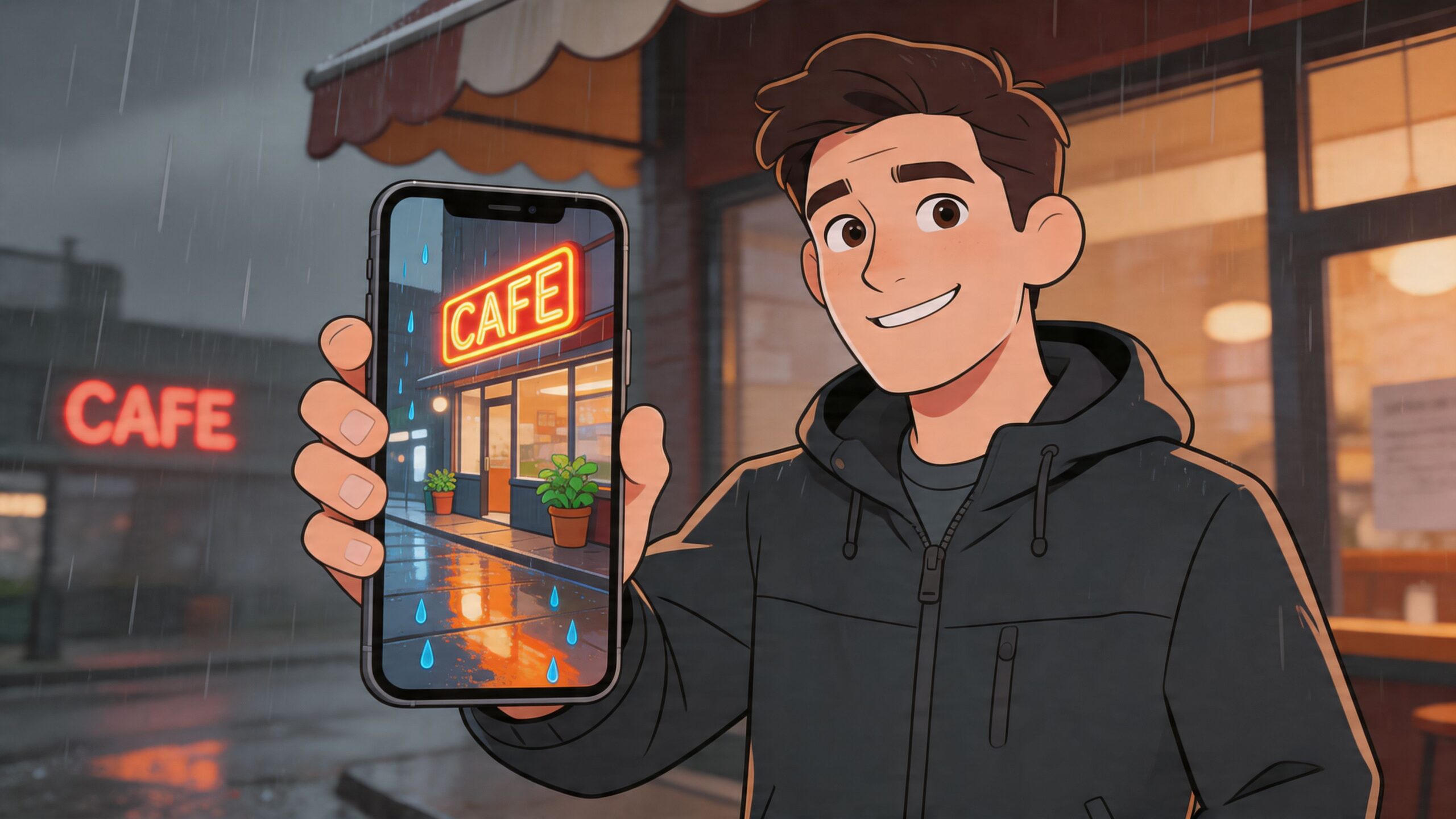
One photo, different framing
A café shot is a good example.
- Feed version might focus tightly on the drink and hands.
- Story version should leave open space near the top or side for text.
- Reel cover version needs bold shape and contrast so it still reads in a tiny grid preview.
That's how to take photos on instagram without wasting captures. You don't need more shots. You need shots framed for the way Instagram displays them.
A Simple Editing Workflow for Professional Results
Editing should make the photo clearer, not louder.
A lot of brands either under-edit and post flat images, or over-edit until the photo stops feeling real. The better approach is a repeatable workflow that keeps the image believable while making it cleaner, brighter, and easier to read on mobile.
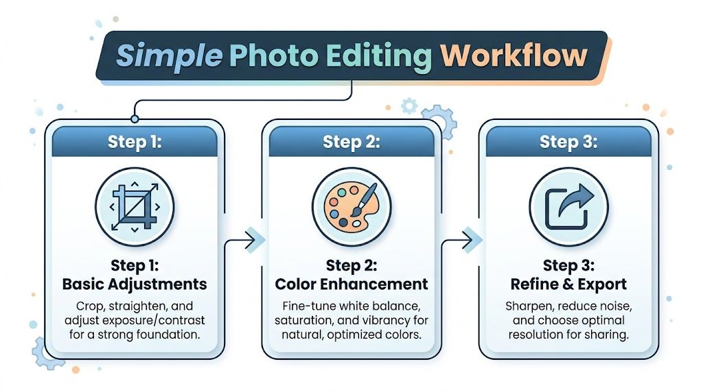
Start with basic corrections
Open the image in your native Photos app, VSCO, or Lightroom Mobile. Do the boring fixes first.
- Crop with purpose so the subject becomes easier to read.
- Straighten lines if walls, tabletops, or horizons are slightly off.
- Correct exposure before touching color.
- Pull back highlights if skies, windows, or reflective packaging are too bright.
- Lift shadows gently if the subject feels buried.
If the original shot is strong, these changes are small. That's a good sign.
Add color carefully
Now shape the mood.
VSCO is useful for quick creative looks, while Lightroom Mobile gives you more precise control. If you're comparing tools, this roundup of the best professional photo editing app is worth reviewing because it breaks down which apps are strongest for different editing styles.
What usually works for Instagram brand photos:
| Adjustment | Use it for | Common mistake |
|---|---|---|
| White balance | Fixing indoor yellow cast or cool outdoor tint | Pushing too warm for a fake golden look |
| Saturation | Making color feel alive | Turning skin, food, or products cartoonish |
| Vibrance | Lifting muted colors more selectively | Using it as a replacement for good light |
| Clarity or texture | Adding detail to products or architecture | Making portraits harsh |
Editing rule: If the first thing you notice is the edit, you've gone too far.
This is a good point to build brand consistency. Save one or two presets, not ten. If every post has a different mood, the grid starts to feel accidental.
For teams that publish often, a stack of creator tools can save serious time. This guide to best tools for content creators is a practical resource if you're building a repeatable workflow across shooting, editing, approvals, and publishing.
A quick visual walkthrough can help if you're training a team member or cleaning up your process:
Export for clarity, not file bloat
Before posting, check three things:
Resolution
Export large enough for Instagram's display needs.Sharpening
Add a touch if the image softened during edits, but don't force crispness.Format fit
Export the version for feed, Story, or cover separately instead of relying on last-minute in-app crops.
That last step matters more than people expect. Good editing can rescue mood and balance. It can't rescue sloppy delivery.
Authentic Photos for Real-World Scenarios
Perfect conditions are overrated.
Most tutorials assume you have flattering weather, a confident model, and someone else holding the camera. That's not how content is typically made. Real brand photography often happens in cramped shops, cloudy streets, small apartments, hotel rooms, or solo creator setups.
A useful guide on how to take photos on instagram has to work there too.
Shoot for different body types, not one default pose
A real gap in photo advice is that it rarely accounts for how different bodies read on camera. According to guidance on body type and real-world shooting challenges, 68% of solo creators report angle distortion issues, and the same source notes the Instagram algorithm penalizes heavy edits by 18%. That pushes you toward better capture choices, especially if you want photos to feel natural.
A few practical adjustments work better than generic posing advice:
- For shorter subjects lower the camera slightly and angle it upward with restraint. Too low creates distortion, but a modest lift can lengthen the body line.
- For taller subjects avoid shooting from below unless the goal is drama. Eye level or slightly above is often more balanced.
- For curvier body types create shape with turns, staggered stance, bent limbs, and hands that have a job. Holding a bag, cup, jacket, or product gives the pose structure.
- For broad shoulders or fuller frames rotate the torso slightly instead of facing square to camera.
The point isn't to hide the body. It's to avoid accidental distortion.
Use angles to create balance, not to chase a completely different body.
Solo shooting that doesn't look like solo shooting
You don't need a photographer to make usable Instagram content. You do need a setup that lets you test quickly.
A mini tripod, a stable ledge, or a clamp mount does most of the work. If you shoot alone often, use a remote shutter or interval timer. Then take several versions with small changes in chin position, shoulder angle, and distance from camera. Tiny adjustments matter more than dramatic pose changes.
These solo habits help:
Mark your spot
Put tape, a leaf, or a bag on the ground so you can step back into frame consistently.Test lens distance
If the camera is too close, features distort. Step back and crop later when possible.Use the rear camera when you can
It usually gives better image quality than the front camera.Review posture between shots
A straight spine, relaxed shoulders, and slight forward energy read better than a stiff pose.
If your team creates lifestyle content regularly, this list of content creation ideas can help you turn one location or one product into multiple believable photo concepts.
Work with bad weather and bad light
Cloudy days are not bad photography days. They're often easier.
Overcast light is soft and forgiving. Skin looks smoother, shadows are gentler, and products hold detail better. In cities, look for bright walls, windows, concrete, awnings, and reflective storefronts. Those surfaces bounce light back onto the subject and can make a dull location much more usable.
Try these location habits:
| Situation | What to do |
|---|---|
| Heavy overcast | Use open sky as a giant softbox and expose for the face or product |
| Rainy street | Use reflections from pavement, windows, or signage for mood |
| Harsh sun | Move into open shade near a bright edge |
| Small indoor space | Turn off mixed overhead lights if they create ugly color casts |
Authentic content doesn't mean sloppy content. It means the image still feels like a real moment after you've made smart choices.
Posting Your Photos for Maximum Brand Impact
A strong photo can still underperform if the post package is weak.
A brand manager might spend 20 minutes getting the shot right in bad indoor light, then post it with a flat caption, broad hashtags, and no clear angle. The result is familiar. Decent reach, low saves, few comments, and no meaningful signal about what the audience wanted. Posting is the last creative decision, and it affects whether the photo earns attention or disappears in the scroll.
Write captions that strengthen the photo
Captions work best when they add something the image cannot carry on its own.
Use the caption to give context, sharpen the point of view, or tell people what to do next. If the image already communicates the full idea, keep the caption short. If the photo shows a real-world challenge, like a fit detail on a fuller body type or a product shot taken in mixed light, say that clearly. Specificity builds trust. It also helps the right audience feel seen.
Three caption jobs tend to perform well:
- Add context when the photo raises a practical question
- Prompt response with a clear opinion, question, or choice
- Support action with a natural next step tied to the post
For example, a clothing brand can post the same image two ways. A generic caption describes the outfit. A stronger caption explains how the fabric sits on different body shapes, why the photo was shot in natural store light, or what customers should notice before buying. That second version gives the audience a reason to save or reply.
Use hashtags with intent
Hashtags still help discovery when they match the photo and the audience.
Skip the habit of piling on broad tags that attract the wrong traffic. A better approach is to choose tags that reflect what is in the image, who it is for, and how someone would search or browse for it. If the post features a real customer, local setting, or specific fit concern, your hashtag choices should reflect that.
A practical mix usually includes:
- Brand-specific tags for campaign tracking
- Niche topical tags tied to the subject of the photo
- Community tags your audience already pays attention to
If you want a stronger framework for replies, saves, and shares around visual content, this guide on how to increase social media engagement is a useful companion.
A good Instagram post is one clear photo, one useful caption, and one focused discovery plan.
Treat each post like a test
Strong teams review patterns, not just likes.
Track which photos get saved. Check whether natural-looking lifestyle shots outperform cleaner product images. Compare a close crop against a wider scene. Watch how often people comment when the caption opens with a practical takeaway instead of a vague line.
This matters even more for brands trying to look real, not overly produced. Photos taken in imperfect light or on a wider range of body types often create stronger connection, but only if the framing, caption, and posting strategy support that honesty. Review the posts that drove profile visits, shares, and DMs, then repeat the parts that earned a response.
